Remember The 7Up “Uncola” Campaign? A Different Kind of Soda
Darrien Eouse
In the late 1960s, soda advertising took a sharp turn. Coke was “The Real Thing.” Pepsi was “The Choice of a New Generation.” And then 7Up stepped in with something different — The Uncola.
The campaign didn’t just sell a drink. It tapped into the cultural mood of the time: anti-establishment, experimental, and willing to challenge what had always been done.
For collectors today, the “Uncola” era stands out not just for the taste of 7Up, but for the bold design, artwork, and signs that came with it.

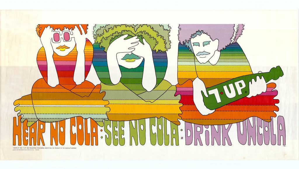
Why “Uncola”?
7Up wasn’t cola. That was the point. In a market dominated by Coca-Cola and Pepsi, the only way to stand out was to lean into being the opposite. The ads used humor, bold visuals, and psychedelic design to drive the message: this isn’t cola — it’s something new.
The word itself — Uncola — was short, catchy, and instantly gave the brand an identity that separated it from the competition.
The Look of the Era

From the late ’60s into the ’70s, 7Up signs and ads featured bright colors, bold arrows, groovy typefaces, and floral artwork. It was advertising that didn’t play it safe.
Billboards, print ads, and neon signs lit up with designs that could have come straight off a rock poster.
It wasn’t just about soda. It was about style. That’s why so many collectors still chase down the original “Uncola” items today — the designs captured a moment in American culture.
The Lasting Impact
The “Uncola” campaign ran for years, becoming one of the most recognizable taglines in advertising. It turned 7Up into more than just another soda option — it became part of the cultural conversation.
For collectors and enthusiasts, the value goes beyond the drink. It’s in the artwork, the neon, the enamel signs, and the way those pieces still light up a room decades later.

Why It Matters to Collectors
The “Uncola” era wasn’t afraid to be different. That’s exactly why the signs and memorabilia from this campaign still hold weight with collectors today. They’re a reminder of when advertising wasn’t generic — it was bold, colorful, and unafraid to stand apart.
Whether it’s a pair of 7Up IN & OUT neon signs or a smaller porcelain piece, “Uncola” designs have a feel that’s impossible to replicate with cheap modern reproductions. They’re part of the reason vintage advertising has such a strong pull.


